The Turboshaft Sunglasses
Logo Design, Identity, Packaging
Branding and packaging for Pit Viper’s Sunglasses, The Turboshaft.

Final Design
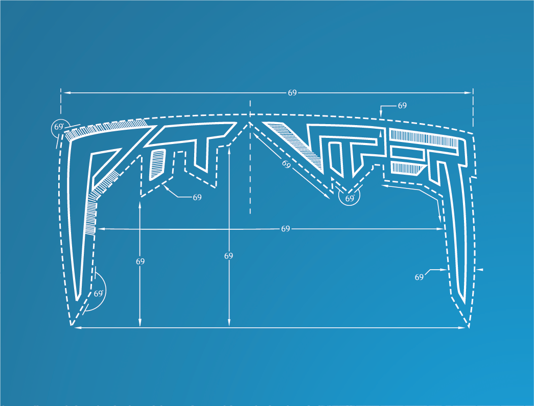
The Turboshaft logo was crafted using a bold oblique variant from the Helvetica font family. By applying a subtle stroke and adjusting the kerning, the logo was refined to resemble the typographic style commonly found in modern engineering or architectural firms.
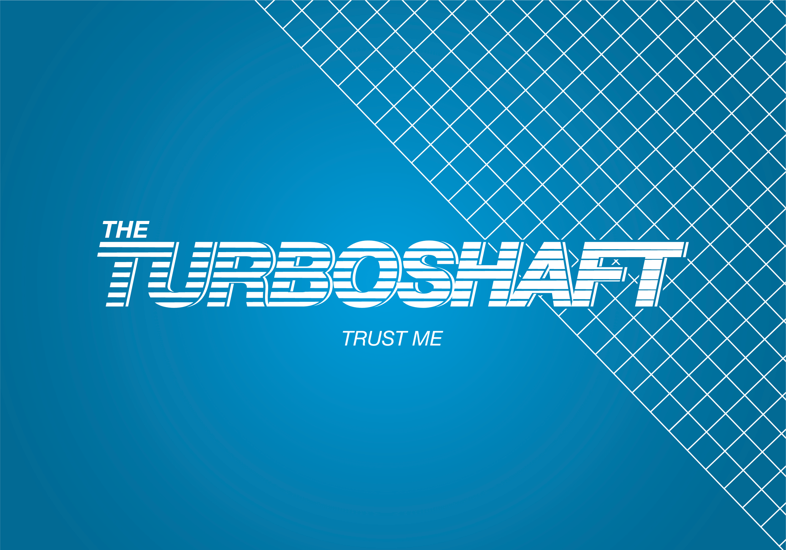


This design foundation allowed for customized enhancements that distinguish the branding without compromising its clean and modern appearance. Specifically, tapered stripes were overlaid onto the font to represent airflow through a turboshaft engine.

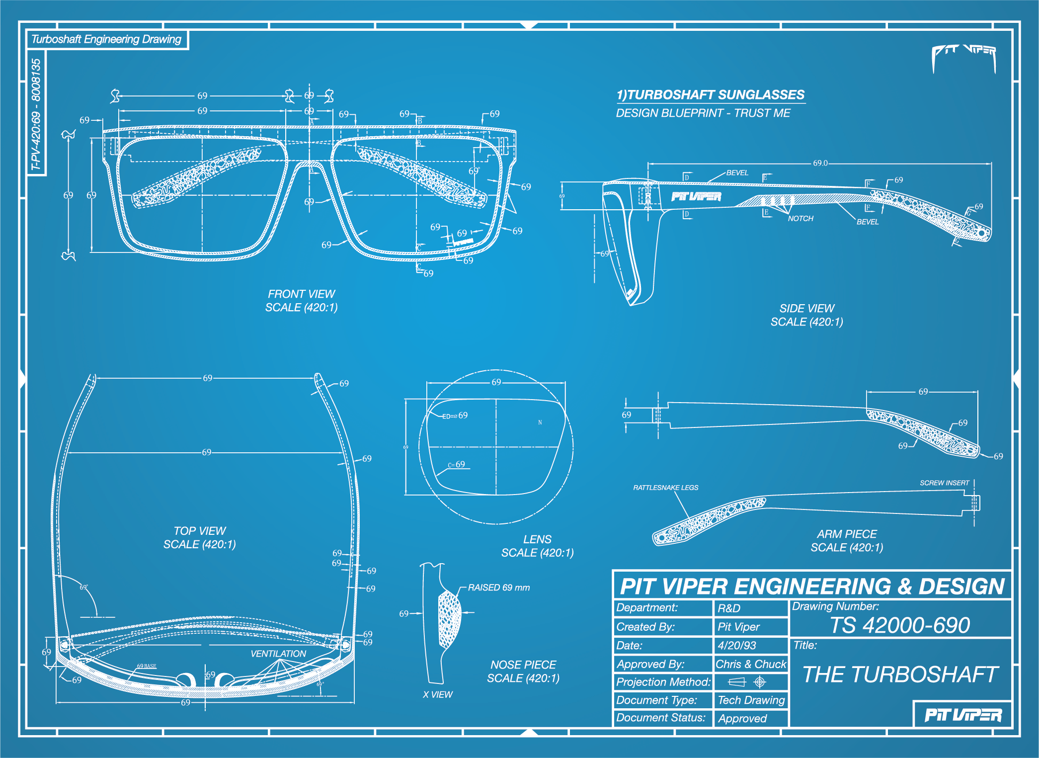
To honor the traditional process of creating blueprints, the design decision was made to implement a two-tone color palette of blue and white.


For the packaging the design concept was centered around engineering technical drawings, and to authentically complement this theme, actual manufacturing schematics provided by our production partner were incorporated.


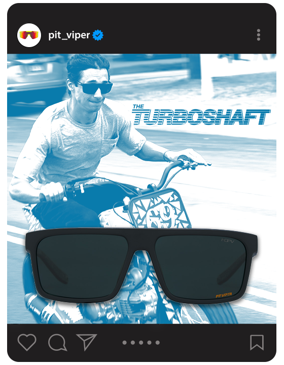
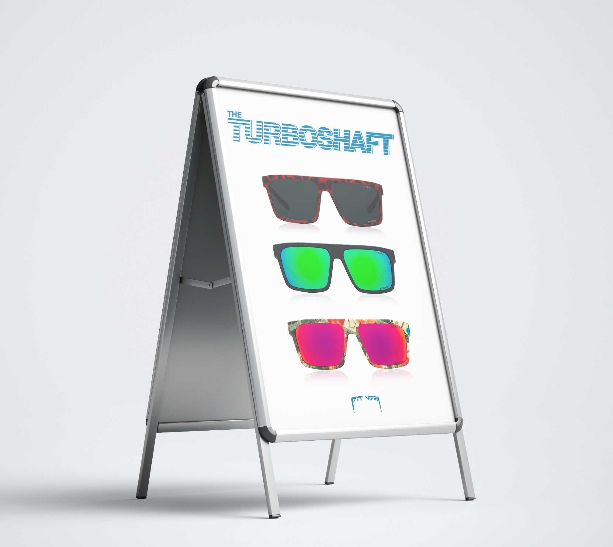
The Turboshaft identity was implemented across all marketing platforms to create a cohesive product marketing strategy.