The Turboshaft Sunglasses
Logo Design, Identity, Packaging
Branding and packaging for Pit Viper’s Sunglasses, The Turboshaft.

Conceptual Iteration
Below is a collection of sketch boards that were created to showcase three different ways in which the branding and identity of The Turboshaft could unfold.
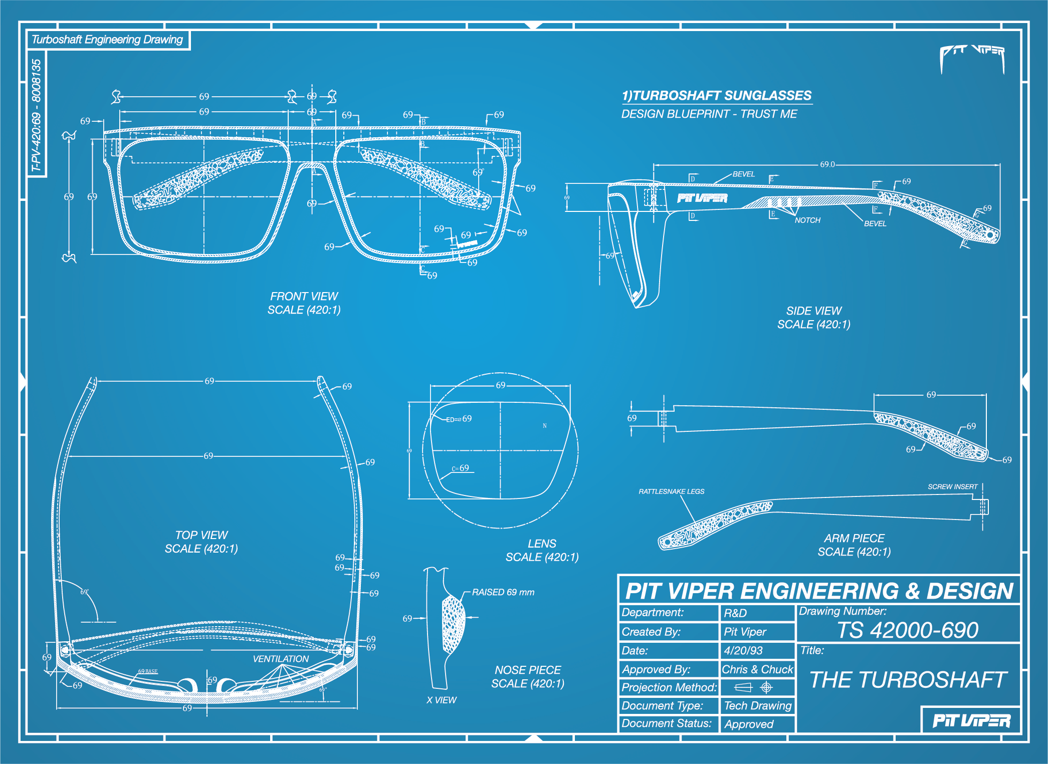
Engineering Drawing
With the slogan for this product being “Trust Me.” It felt fitting to explore a branding route that leaned into the world of architectural design and engineering. The Turboshaft, compared to Pit Viper’s other products, is a toned down style that is to be used as an everyday pair of sunglasses. Nothing flashy, just eyewear that can be worn daily without attracting too much attention. As a team we felt that this design theme represented the product well, while also providing a lot of flexibility to keep the branding comical.
Hardshell Pelican Case
The primary target demographic for these sunglasses is fishermen. To appeal to this crowd, we initially proposed designing an identity based around watertight cases—specifically, the Pelican Case—so that the packaging would resemble a rugged, water-resistant container. Although the idea was fun and initially compelling, we ultimately decided not to pursue this idea because we felt it might not be the most effective idea from a marketing standpoint.
Vintage Racing
With motor-heads as a key demographic, we initially considered adopting a vintage raceway aesthetic for the product branding. While Pit Viper already enjoys strong recognition within the motorsports community, we were concerned that this retro-racing theme might overly narrow our appeal and pigeonhole the product as purely motorsports-specific eyewear. As a result, our team opted not to pursue that direction.


Final Design
Pit Viper is an eyewear brand known for bold expression and vibrant designs that contrast with the typically muted tones common in the outdoor industry. While this distinct aesthetic has successfully cultivated a niche audience, we recognize that not all consumers resonate with high-visibility styles. To address this, we developed The Turboshaft: a versatile, performance-driven rectangular frame designed as an everyday option for a broader demographic. The objective of this project was to create a more subdued identity without losing the brand’s signature irreverent spirit.
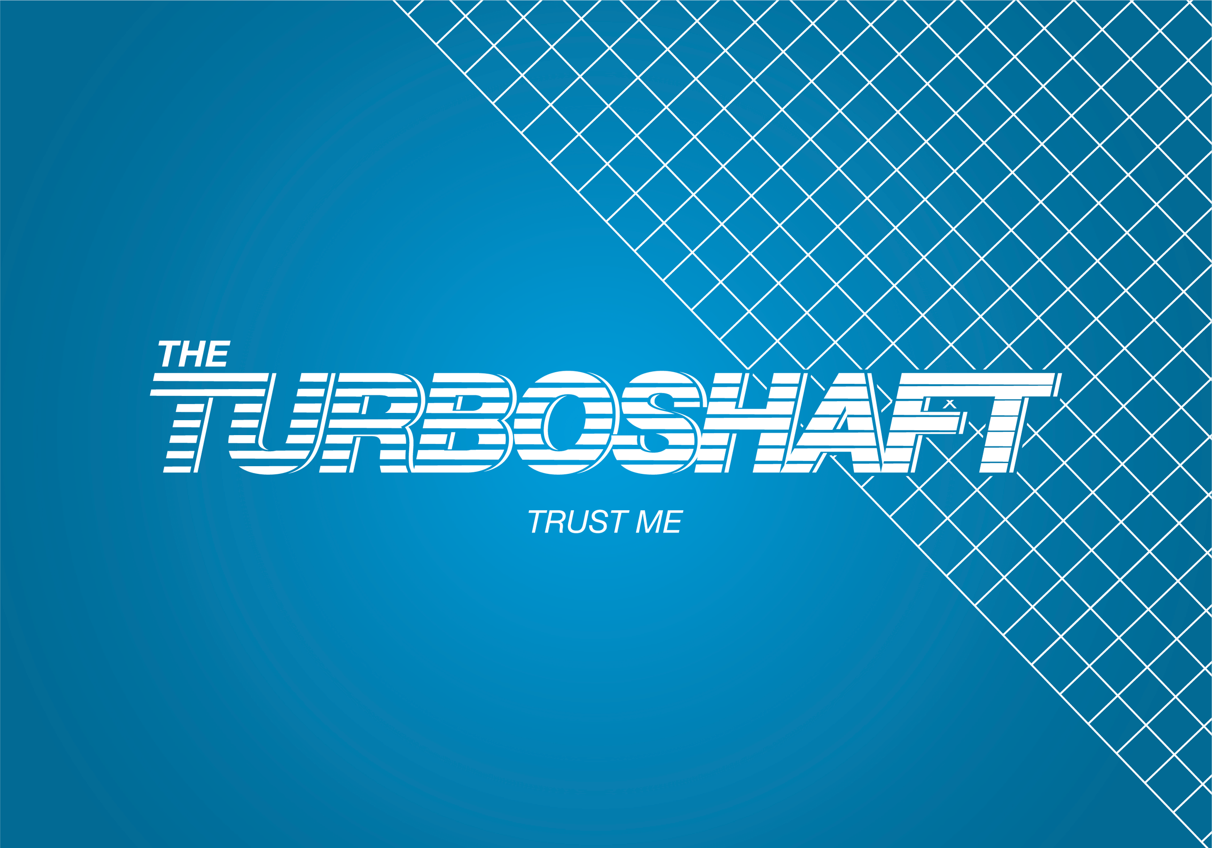
Turboshaft engines are a type of gas turbine optimized to produce shaft horsepower rather than jet thrust. These engines are commonly employed in applications requiring sustained high power output, high reliability, and lightweight construction. Similarly, The Turboshaft sunglasses are engineered to embody these attributes—reliability, lightweight design, and versatility across various applications. With the objective of developing a clean logotype that aligns with the product slogan “Trust me,” the realms of engineering and architectural design emerged as key sources of inspiration during the branding process. Both disciplines are widely recognized for their use of minimalist logos and clean logotypes.
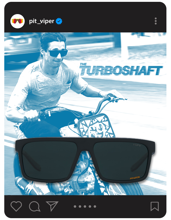
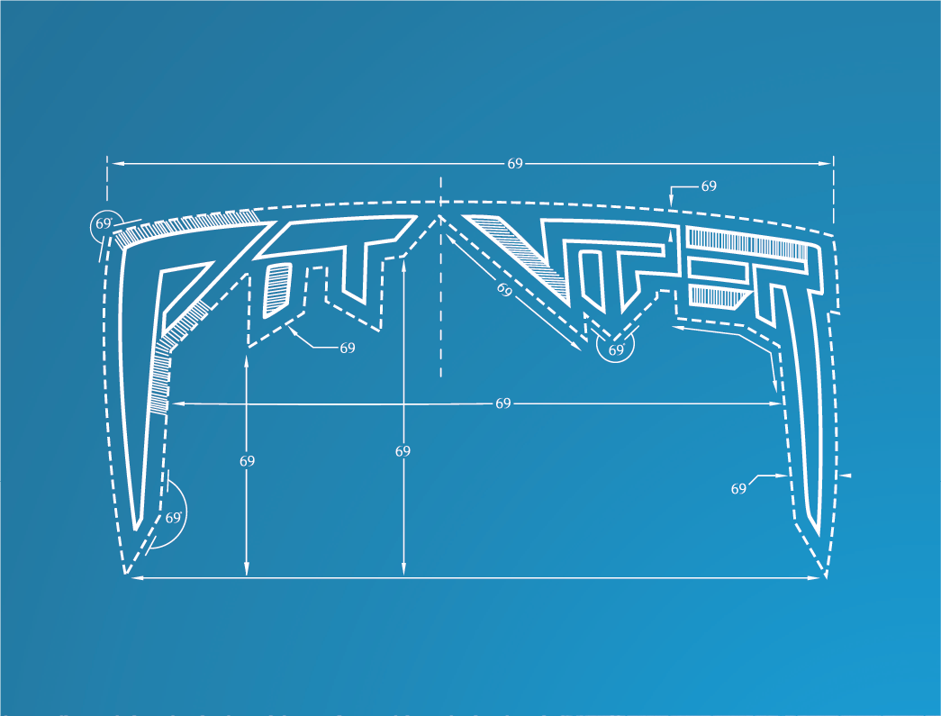
The Turboshaft logo was crafted using a bold oblique variant from the Helvetica font family. By applying a subtle stroke and adjusting the kerning, the logo was refined to resemble the typographic style commonly found in modern engineering or architectural firms. The sans-serif font was specifically selected for its simplicity and clarity, contributing to a neutral aesthetic that supports adaptability. This design foundation allowed for customized enhancements that distinguish the branding without compromising its clean and modern appearance. Specifically, tapered stripes were overlaid onto the font to represent airflow through a turboshaft engine. This visual motif also highlights a key functional feature of the sunglasses—ventilation ports positioned along the top edge of the frame, which are engineered to reduce facial perspiration during physical activity.
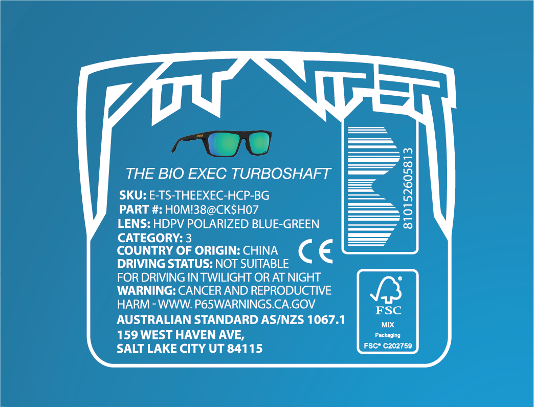
The foundation of any engineering design is a technical drawing, serving as the assembly instructions that translate conceptual ideas into tangible reality. These technical drawings, commonly referred to as "blueprints," were historically produced using the cyanotype process—a photographic technique developed by Sir John Herschel in 1842. This method involved exposing paper coated with certain chemicals to ultraviolet light, resulting in a distinctive blue background with white lines, where the light-sensitive chemicals were not exposed. To honor this traditional process, the design decision was made to implement a two-tone color palette of blue and white.
For the packaging the design concept was centered around engineering technical drawings, and to authentically complement this theme, actual manufacturing schematics provided by our production partner were incorporated. Specifically, we utilized the factory-issued technical drawings of The Turboshaft, which were edited to serve as the primary graphic element on the packaging. At Pit Viper, we place significant emphasis on the unboxing experience, aiming to transform it into a memorable event rather than a mere transaction. To achieve this, we strategically embed humor and hidden "Easter eggs" throughout the packaging, ensuring that when the consumer receives the product, the experience extends beyond the initial unboxing and avoids the typical fate of being discarded immediately.
The Turboshaft. Trust Me.
The Turboshaft logo was crafted using a bold oblique variant from the Helvetica font family. By applying a subtle stroke and adjusting the kerning, the logo was refined to resemble the typographic style commonly found in modern engineering or architectural firms.


This design foundation allowed for customized enhancements that distinguish the branding without compromising its clean and modern appearance. Specifically, tapered stripes were overlaid onto the font to represent airflow through a turboshaft engine.

To honor the traditional process of creating blueprints, the design decision was made to implement a two-tone color palette of blue and white.


For the packaging the design concept was centered around engineering technical drawings, and to authentically complement this theme, actual manufacturing schematics provided by our production partner were incorporated.


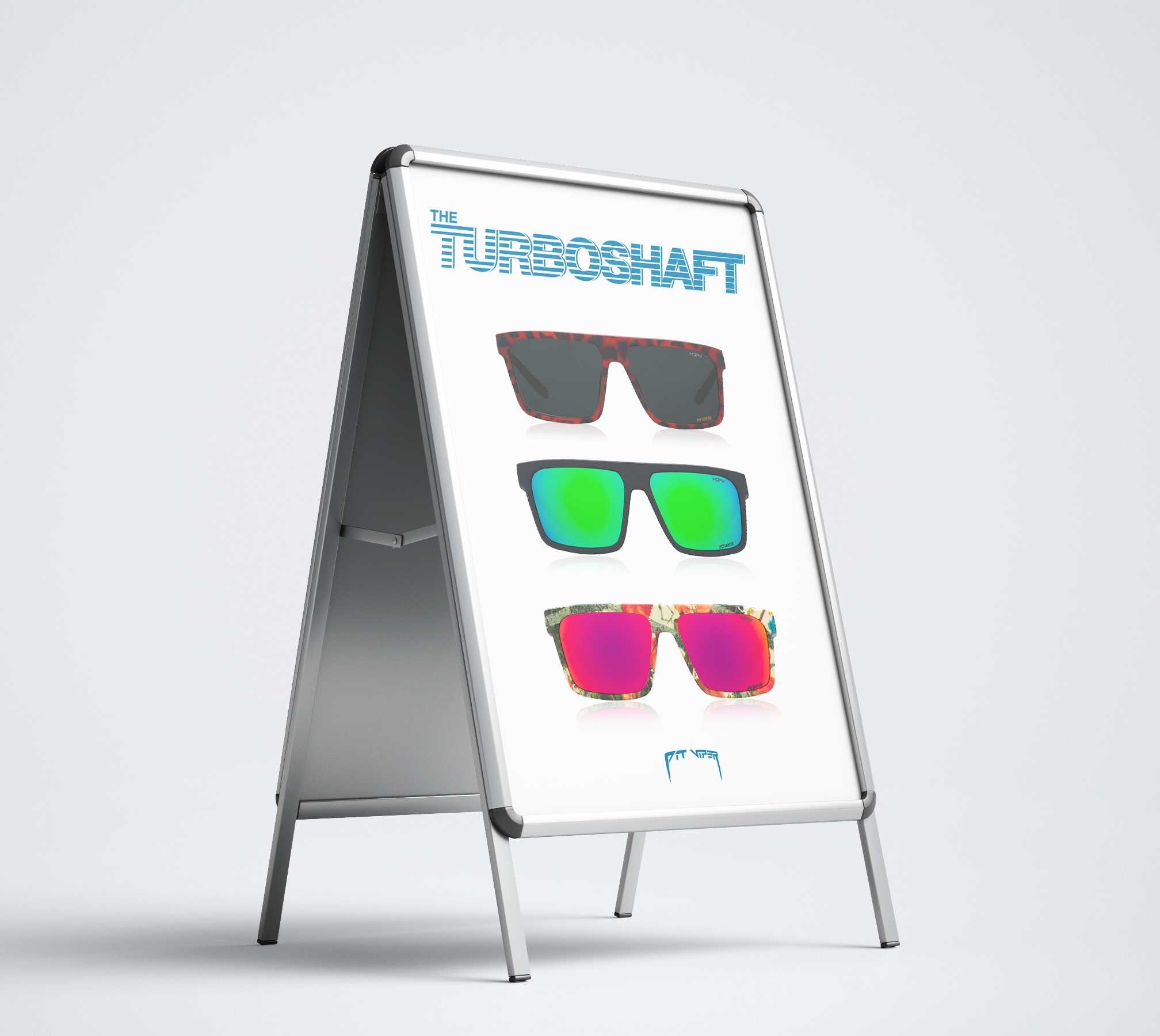
The Turboshaft identity was implemented across all marketing platforms to create a cohesive product marketing strategy.