The Proform Goggle
Branding, Packaging
Branding and packaging for Pit Viper’s premium snow goggle, The Proform.
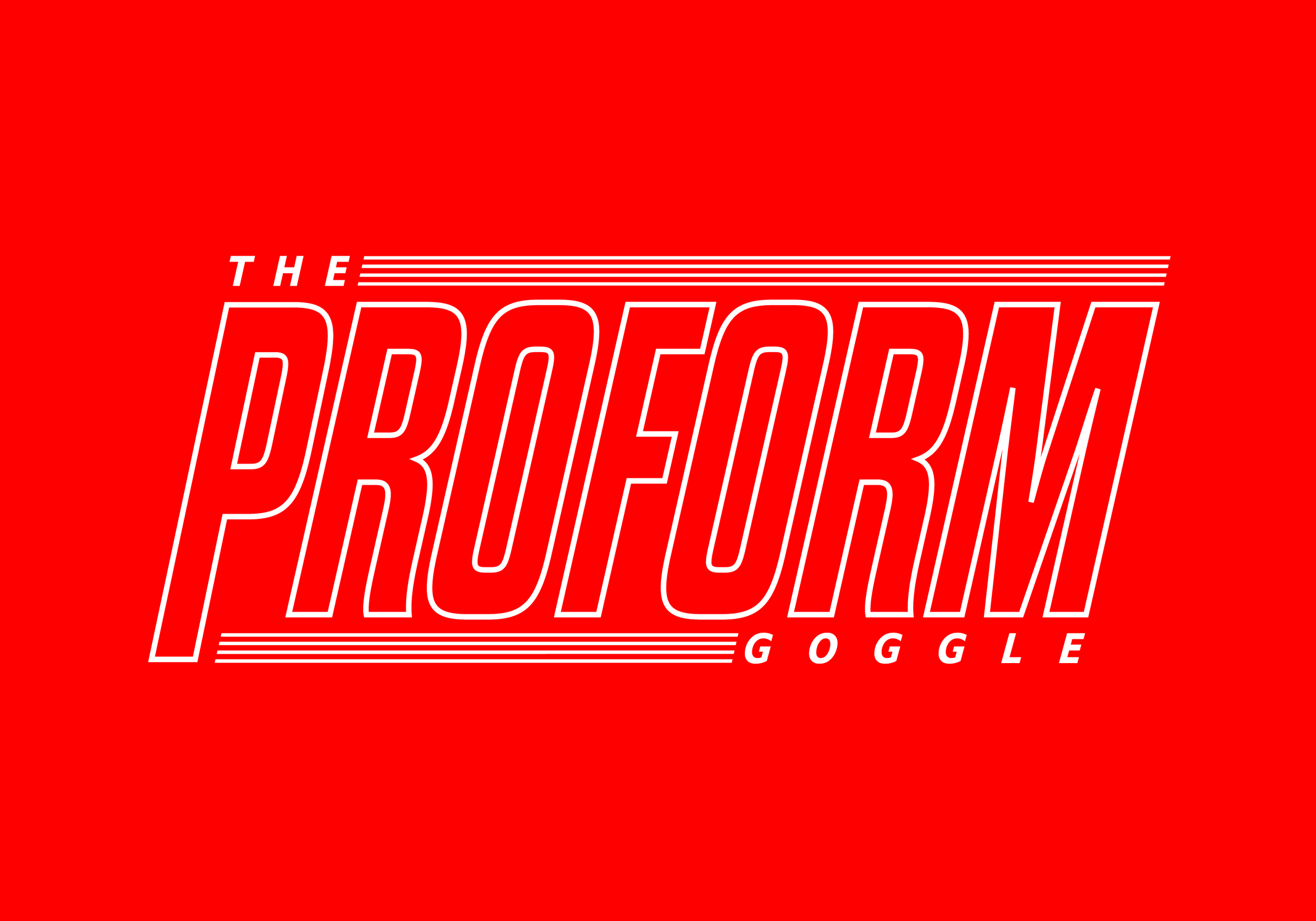
The name and its bold identity aim to reflect the main features offered within the product as well as the audience who will appreciate its premium features at half the price.
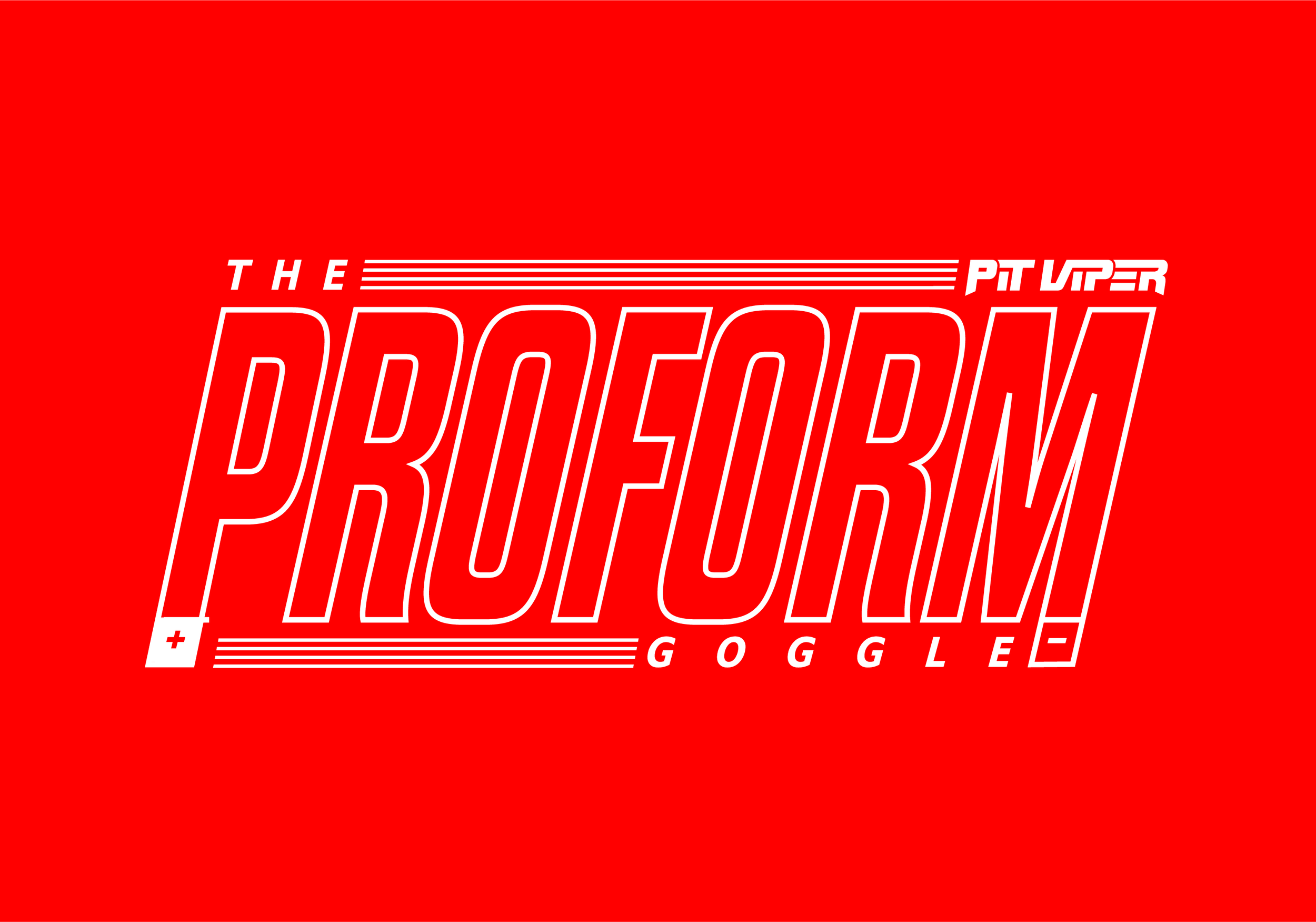
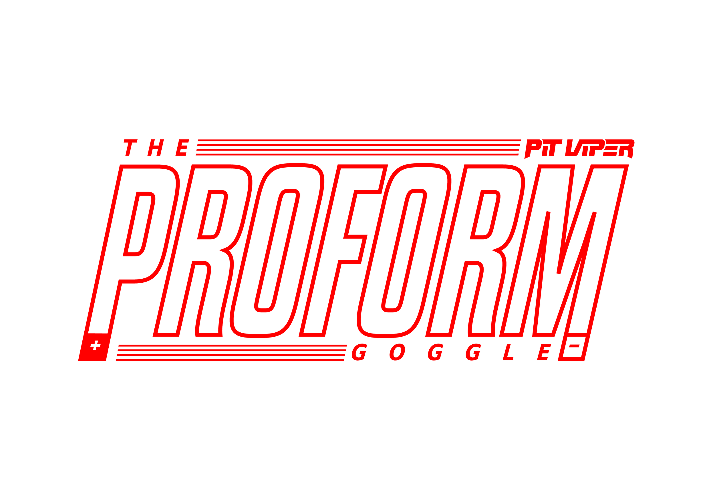
Tall and hollow, the logo is inspired by the frame and lens of the goggle. The outer stroke lends to the minimal goggle frame, while the punched out hollow center references the “field of vision” a user will experience when wearing The Proform Goggle.

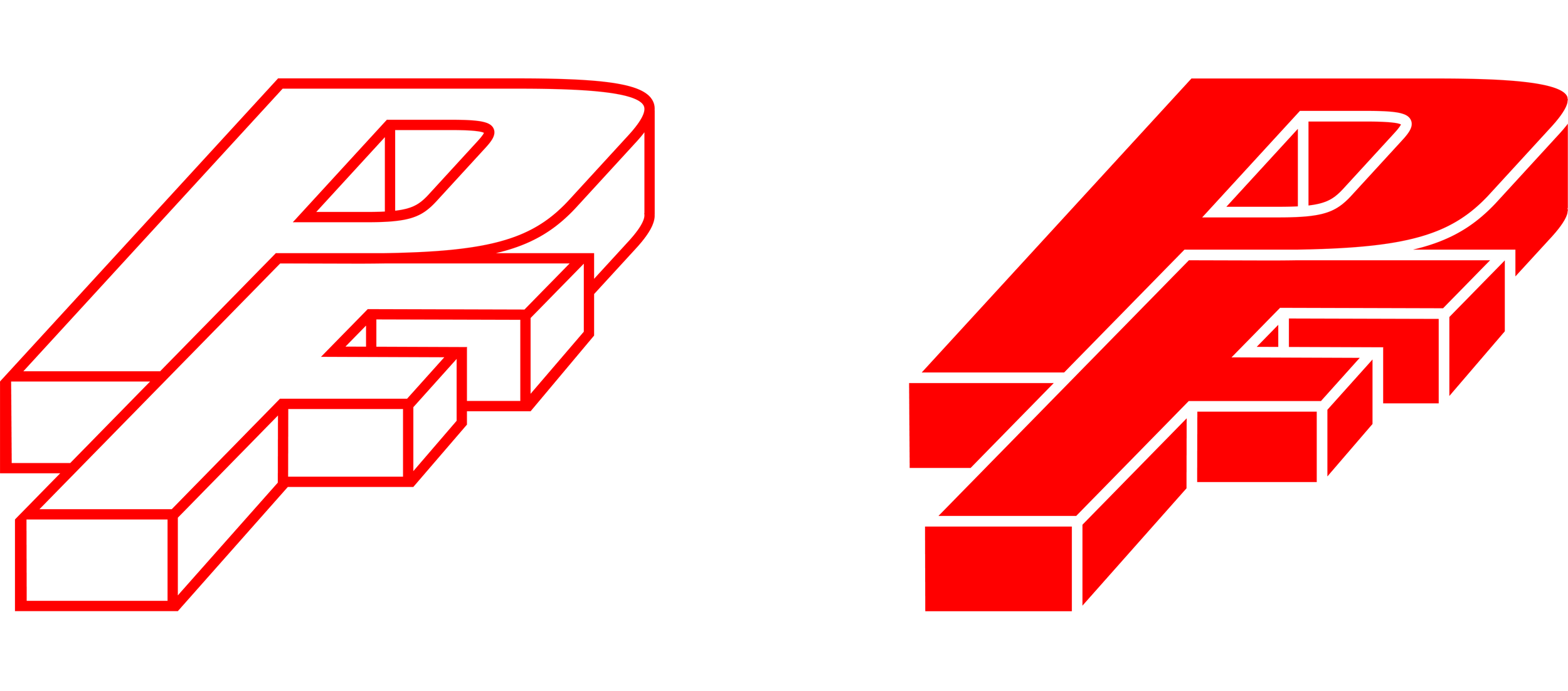
The two-tone color palette is a nod to the classic polarization of magnets and their varying poles. The PF monogram was created to represent the block shape of a magnet, with the P and F being “stuck” together, like two magnets.


The theme of “polarization” carries through to how the content is displayed on the packaging. The top of the box is white to represent the North (+) Pole of a magnet, while the bottom of the box is red to represent the South (-) Pole of a magnet.

