The Proform Goggle
Branding, Packaging
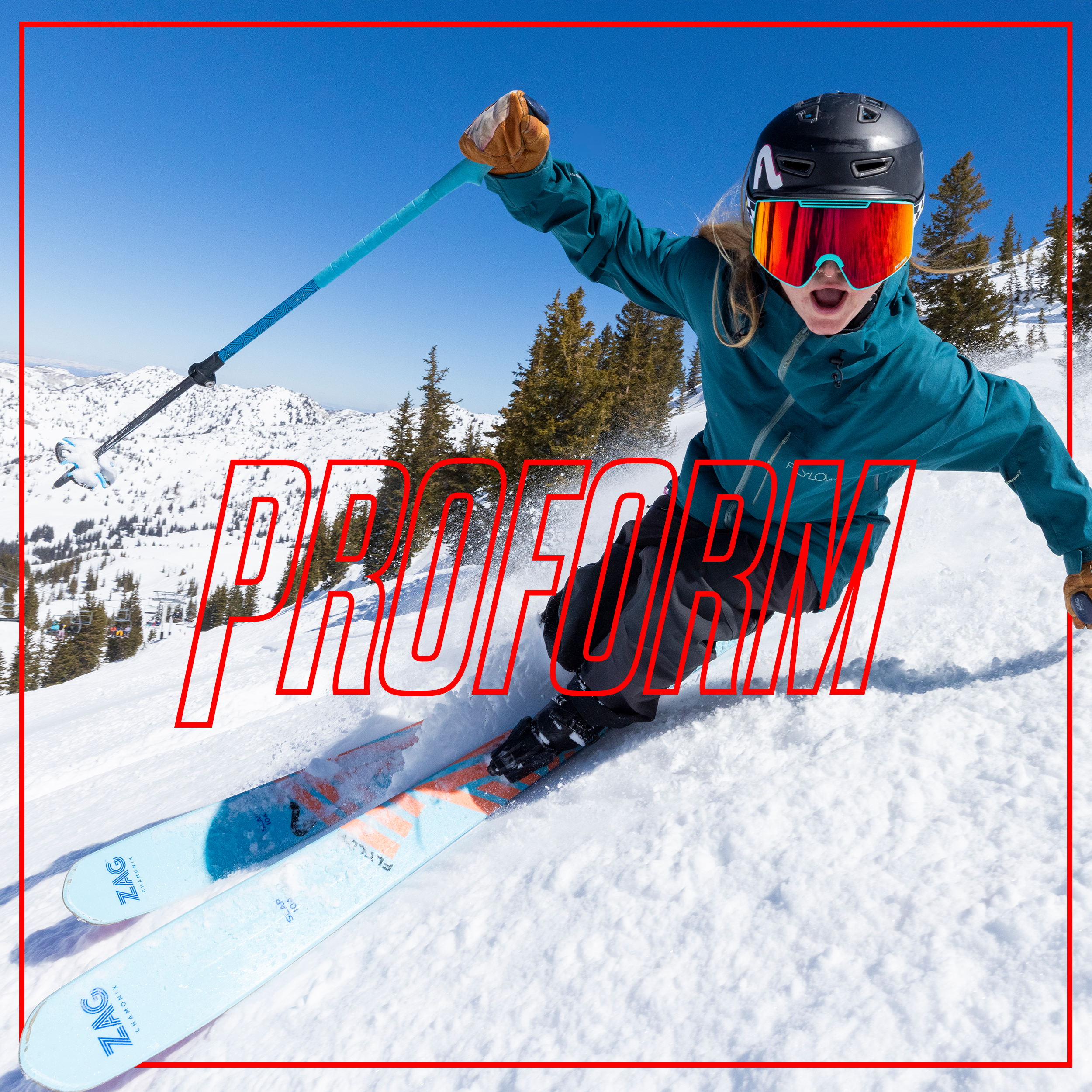
Branding and packaging for Pit Viper’s premium snow goggle, The Proform.
Pit Viper is an industry shaking independent eyewear company that creates eyewear that can take a beating. Consisting of unique, mold-breaking products that are designed for the optimal blend of style and performance. Pit Viper created The Proform Goggle as its first entry into the premium snow goggle market.
For customers who want a premium goggle with all the standard features, at half the price. The Proform Goggle aims to do just that. The biggest, clearest, most innovative goggles on the mountain. Magic Magnets™ make for fast, easy lens swaps, while the Hyperventilator™ ensures maximum airflow for a fog-free view, so you’re ready in any condition.
The name Proform was decided on as a team, and is a reference to the “proform discounts” you receive when working as an expert in the outdoor industry. In an industry that lacks equal pay and great benefits, the discounts, also referred to as “proform,” are a highly touted benefit of outdoor enthusiasts. The name and its bold identity aim to reflect the main features offered within the product as well as the audience who will appreciate its premium features at half the price.
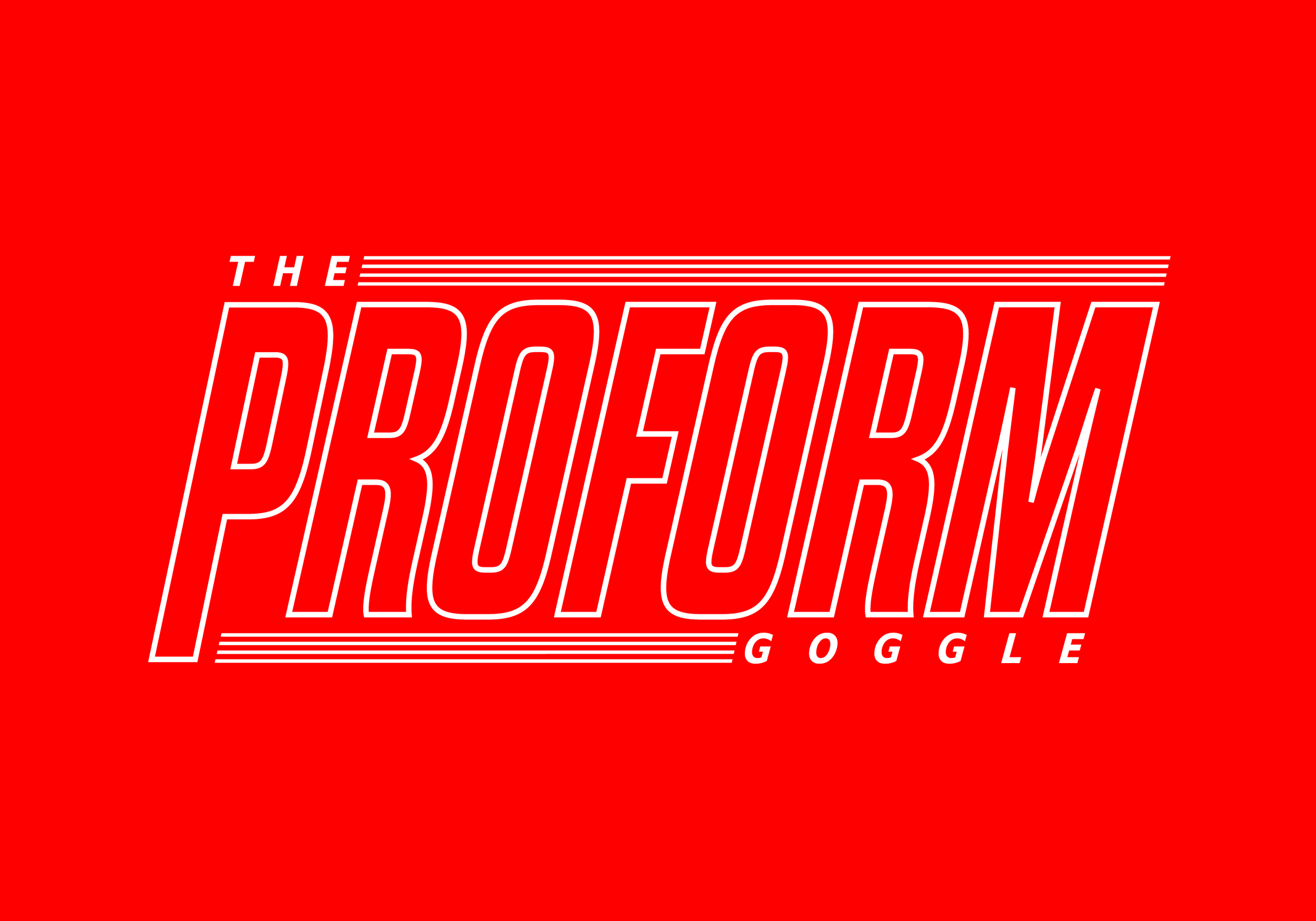
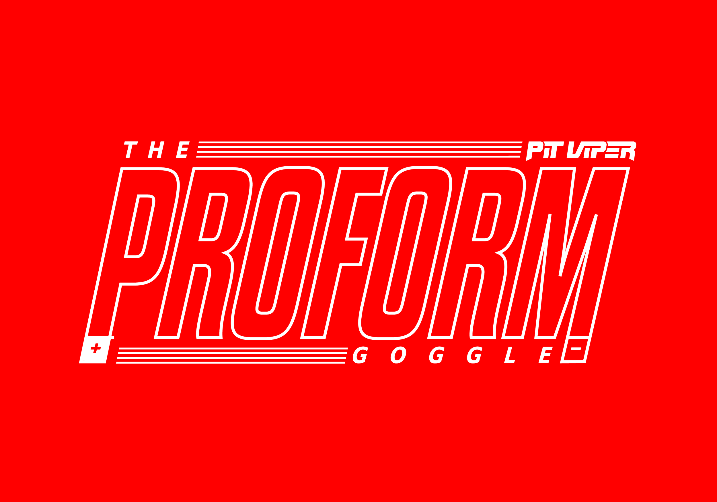
The Proform logo is a modified version of the sans-serif font Dharma Gothic, originally created by Ryoichi Tsenukawa for the Dharma Type Foundry. Tall and hollow, the logo is inspired by the frame and lens of the goggle. The outer stroke lends to the minimal goggle frame, while the punched out hollow center references the “field of vision” a user will experience when wearing The Proform Goggle.
The main logotype incorporates subtle additions that point to the key features of the goggle. 4 lines framing the logo above and below directly referencing the hyperventilator and 360º ventilation. While the P and M extend like poles of a magnet using a + and - to act as a scientific diagram of a magnet. Alternative variations of the logotype were created so the branding can be used in various applications.
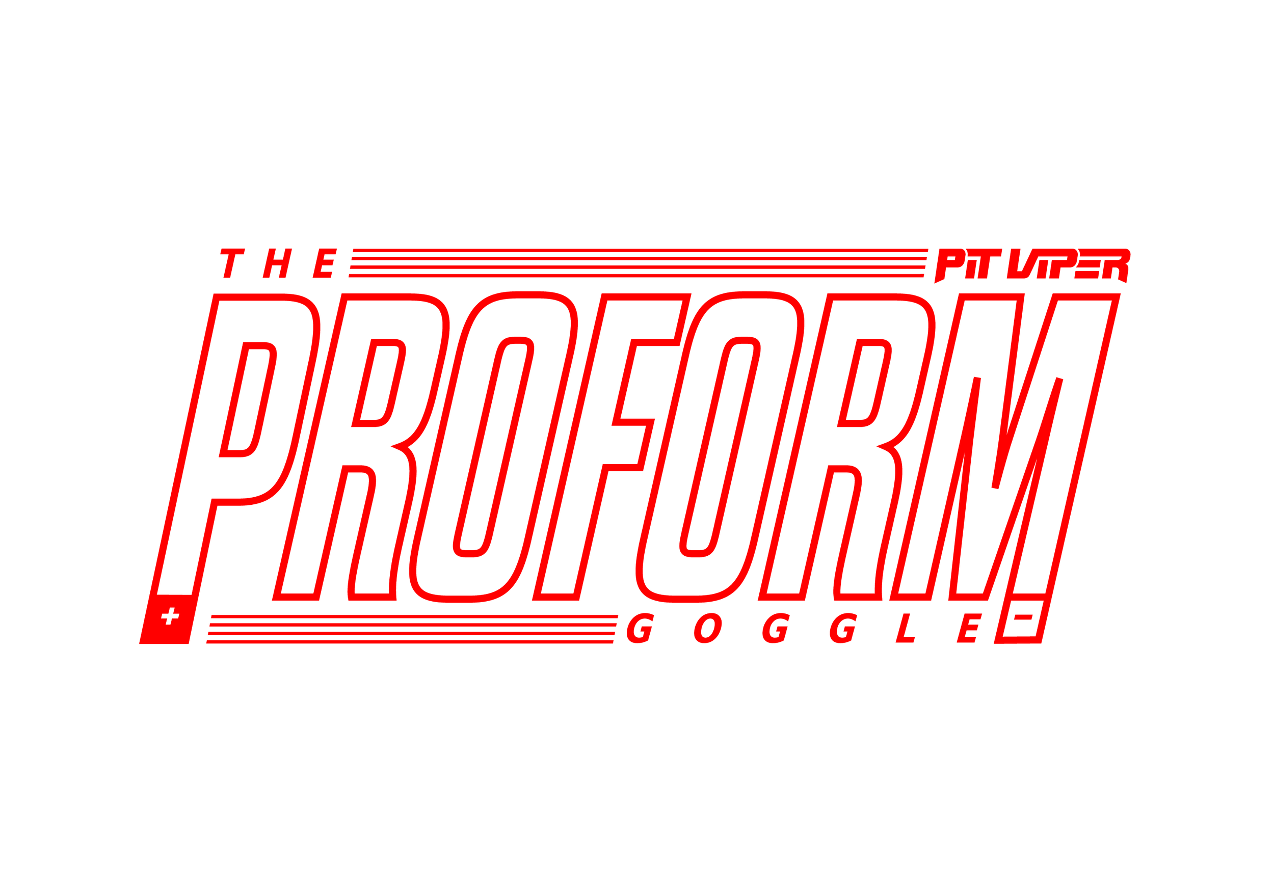
The two-tone color palette is a nod to the classic polarization of magnets and their varying poles. White for positive (+) polarization and red for negative (-) polarization. The stark contrast of white to red was chosen to emulate the feeling of seeing a bright color in the middle of a snow covered basin. A common sight when spending time in the mountains.
The theme of “polarization” carries through to how the content is displayed on the packaging. The top of the box is white to represent the North (+) Pole of a magnet, while the bottom of the box is red to represent the South (-) Pole of a magnet. The background of the packaging is a white cold pressed paper, which emulates the concept of fresh fallen snow. Utilizing all four sides of the packaging, two sides use the logotype, while the other two panels are used to display information about the product. The front panel is used to showcase an image of the product with its key benefits, while the back panel was reserved to tell a joke. One of the most important aspects of Pit Viper as a brand is humor. They are serious about taking things less seriously. With this in mind, the back panel was designed to incorporate a joke. In this case, we have a mad scientist explaining how magnets work in a fashion that pokes fun at the consumer, while also educating them on why this product is superior to other products on the market.
The Profrom Goggle. Go Biggerer.
The name and its bold identity aim to reflect the main features offered within the product as well as the audience who will appreciate its premium features at half the price.
Tall and hollow, the logo is inspired by the frame and lens of the goggle. The outer stroke lends to the minimal goggle frame, while the punched out hollow center references the “field of vision” a user will experience when wearing The Proform Goggle.

The two-tone color palette is a nod to the classic polarization of magnets and their varying poles.
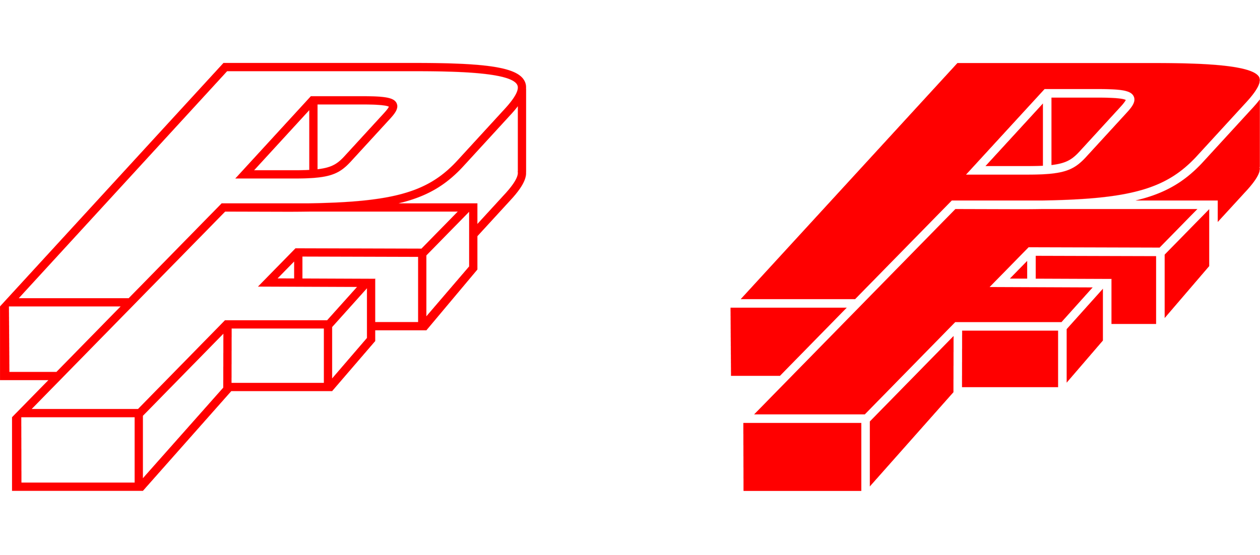
The PF monogram was created to represent the block shape of a magnet, with the P and F being “stuck” together, like two magnets.

The theme of “polarization” carries through to how the content is displayed on the packaging. The top of the box is white to represent the North (+) Pole of a magnet, while the bottom of the box is red to represent the South (-) Pole of a magnet.


Key feature icons were created to easily educate the consumer on the main benefits of the goggle.