The Clawdia Sunglasses
Branding, Packaging, Apparel
Branding and packaging for Pit Viper’s cat eye sunglasses, The Clawdia.

Inspiration
When ideating initial design concepts the marketing team defined one rule. These glasses must be heavily cat themed. With this in mind three concepts were brainstormed as possible directions that the Identity for The Clawdia could unfold.

Concept 1: Middle School Folder & Kitten Imagery

Concept 2: Cat Toy Packaging

Concept 3: Crazy Craft Cat Lady
Conceptual Iteration
Below is a collection of initial sketch boards that I created to showcase the three different concepts in more depth.
Middle School Notebook

Remember that one kid in class who always had the craziest notebook cover? The one with all the stickers and cool doodles all over it. This was the idea behind this sketch board. It was designed with the idea that it was taken from a middle school notebook from the early 90’s. By using stickers, old photos, and doodles, I made this sketch board come to life to give the feel that you’re thumbing through your old notebook from 6th grade. The color palette was created to embody feminine identity with the selection of purple and pink. The choice of yellow was chosen to give the feeling of warmth like a cozy day skipping school and sitting in the front living room playing with your cats all day.
Classic Cat Toy

This idea came to me when I was walking the isles at the local pet store and saw all the packaging that existed for cat toys. Some of it good, and some of it ah board to give the feel of purchasing a sub-par cat toy. I chose purple and orange to be somewhat complimentary , while the green was chosen to clash with the orange, giving the aesthetic of a “questionable” design choice.
Cat Person Arts & Crafts

Feeding on the crazy cat person theme. I felt it necessary to design a theme in which I really leaned into the feel of DIY arts & crafts. It seems that most peopl that really love cats, also really love home made arts & crafts. To help this idea come to life I used wallpaper imagery, hand stitched quilting treatments, and objects made of yarn. The colors were chosen to keep things light, fun, and crafty.
Final Design
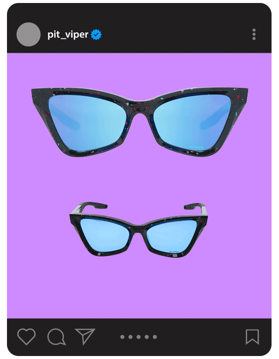
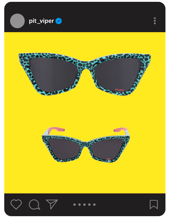
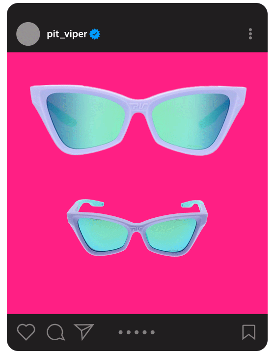
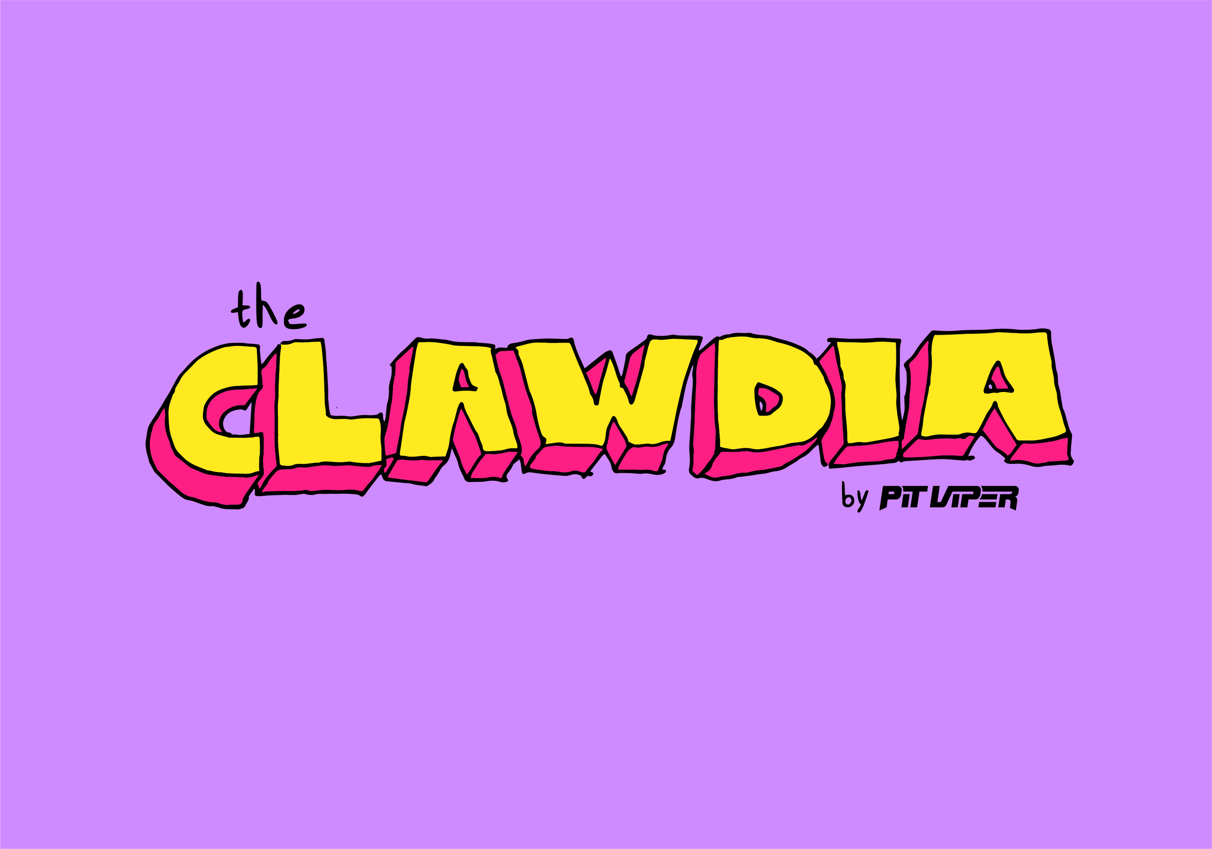
The Clawdia is a cat-eye shaped sunglass from Pit Viper that is designed for the outdoor enthusiast that also loves a good party. The goal of this project was to create a cat themed identity that leans into the nostalgia of the early 2000’s. In this case, the classic middle school folders and notebooks.
The name Clawdia has a fun dual meaning. First, the name is rooted in its female identity origin name “Claudia.” which to our team sounded like a strong female name that would clearly represent the femininity of these glasses. Second The name was modified to include a “w” instead of a “u” to point to a feline’s most important tool of defense, it’s claws. These sunglasses were designed for women sending it big. When attacking steep descents, rugged terrain, or any other obstacle that may be thrown their way the consumer can navigate in style and confidence with the tool of choice. The Clawdia.
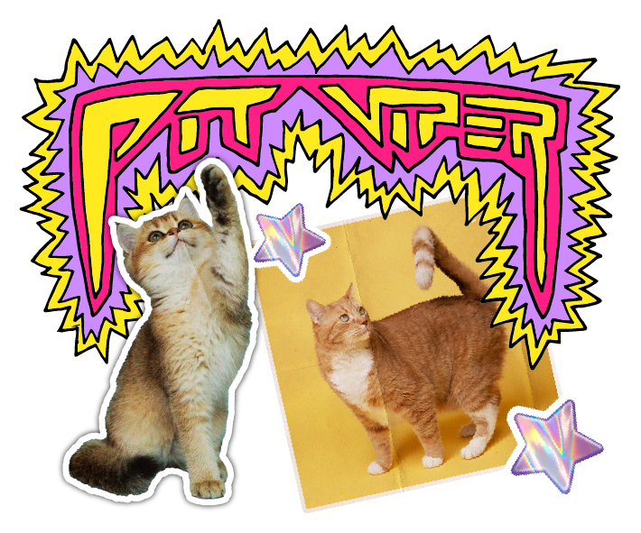
The Clawdia logo is a stylized hand drawn 3D block letter, with rough starbursts surrounding the main logotype. The logo was drawn with a ball-point pen on copy paper, and scanned to create a digital version that could be modified with color. The idea of this logo was to create a doodle that would be found within a middle school notebook, or note that is being passed around class. The hand-drawn aesthetic within this logo is a key feature in giving The Clawdia a DIY middle school feel.
The main graphic designed for this product is a cat collage made to mimic something you would see on the cover of a 6th graders middle school folder. The intention with this graphic was to create something that could be used on packaging and apparel that would embody the same feeling you would get when opening your favorite folder to turn in your late homework assignment. Even if the assignment was late, you still got to admire the amazing artwork on the front of that folder.
The tri-tone color palette was chosen as three fun colors that compliment each other well. The purple and pink were chosen to lean into the female identity of this product. While, the yellow embodies the feeling of warmth, similar to the feeling you would get when skipping school to spend all day in your front living room playing with your cats. Together all three colors work simultaneously to create a loud and punchy graphic that jumps off the page.
The middle school notebook theme is carried through to the packaging, where there are many collage style elements overlaid on tie-dye background to give a feel of calming chaos. The colors are meant to keep things fun, and light. While the collage style imagery is meant to lean into the DIY notebook cover aesthetic.
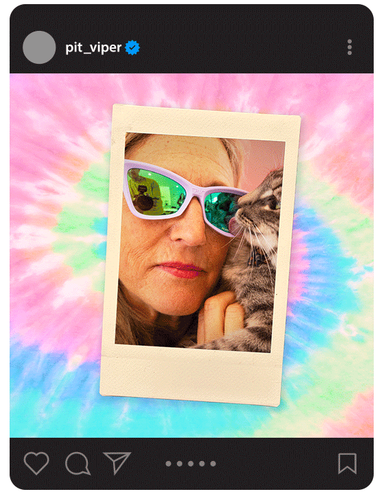
The Clawdia. Land On Your Feet.
The Clawdia logo is a stylized hand drawn 3D block letter, with rough starbursts surrounding the main logotype. The logo was drawn with a ball-point pen on copy paper, and scanned to create a digital version that could be modified with color.


The hand-drawn aesthetic within this logo is a key feature in giving The Clawdia a DIY middle school feel.


The main graphic designed for this product is a cat collage made to mimic something you would see on the cover of a 6th graders middle school folder.


The middle school notebook theme is carried through to the packaging, where there are many collage style elements overlaid on tie-dye background to give a feel of calming chaos