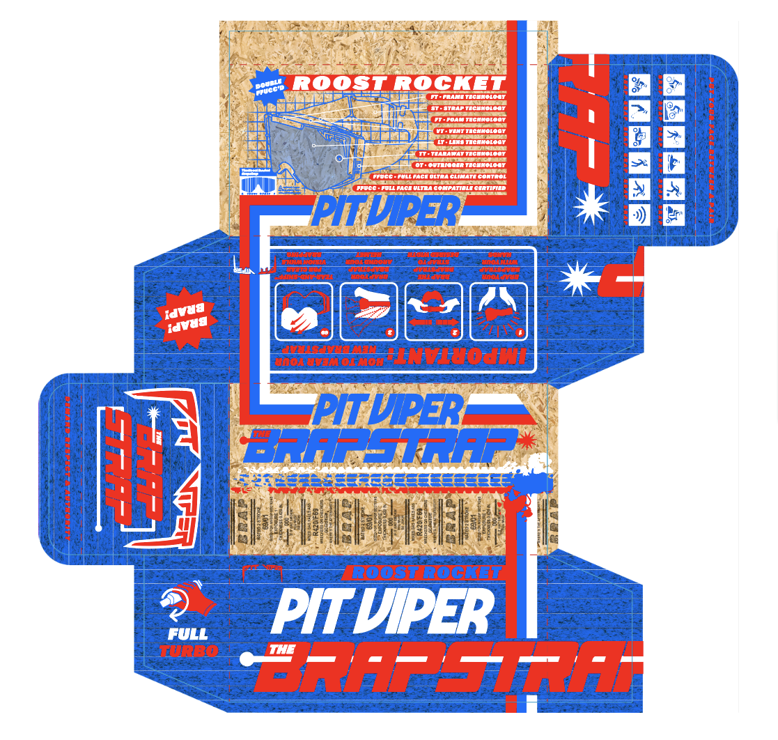
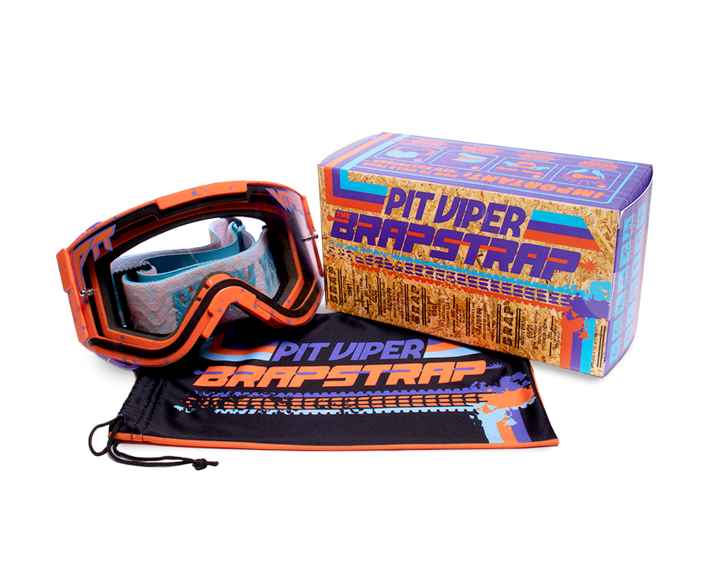
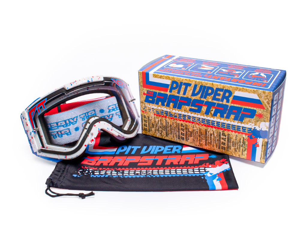
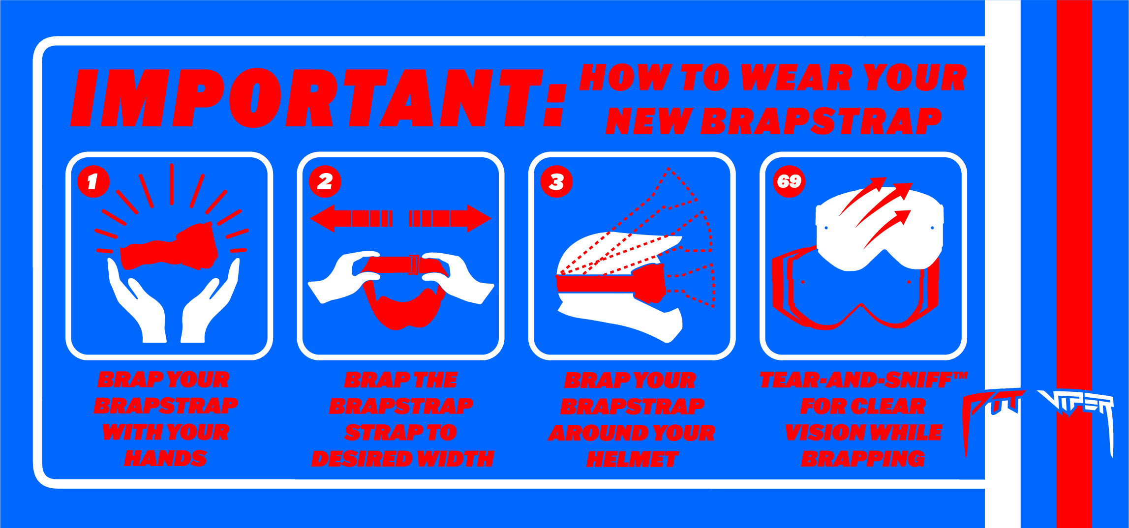
The Brapstrap Goggle
Logo Design, Identity, Packaging, Apparel
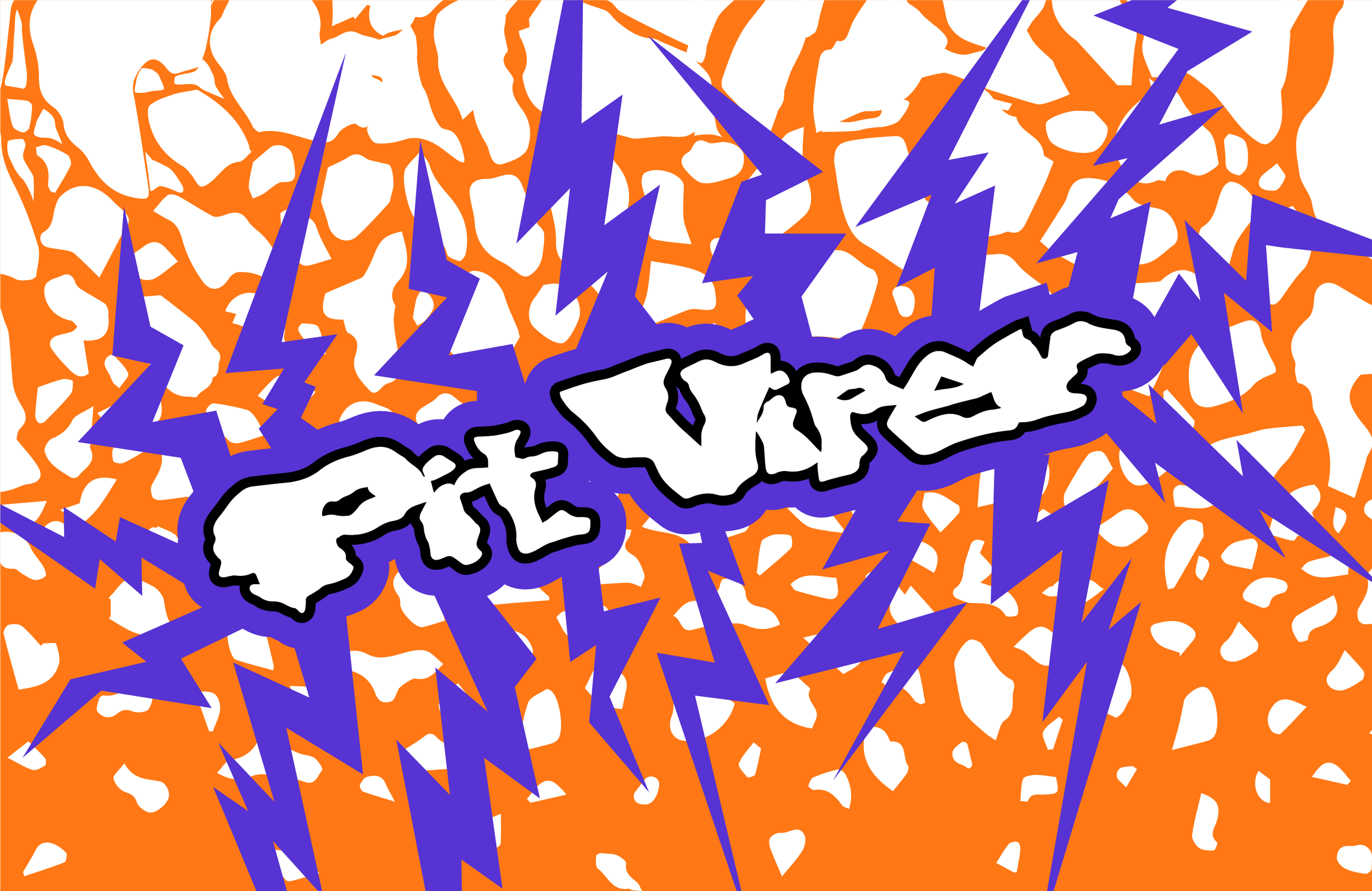
Branding and packaging for Pit Viper’s motocross goggle, The Brapstrap.
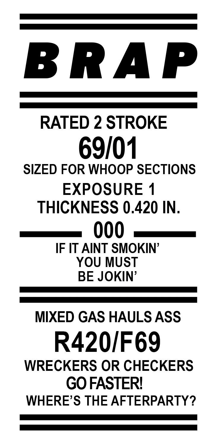
Final Design
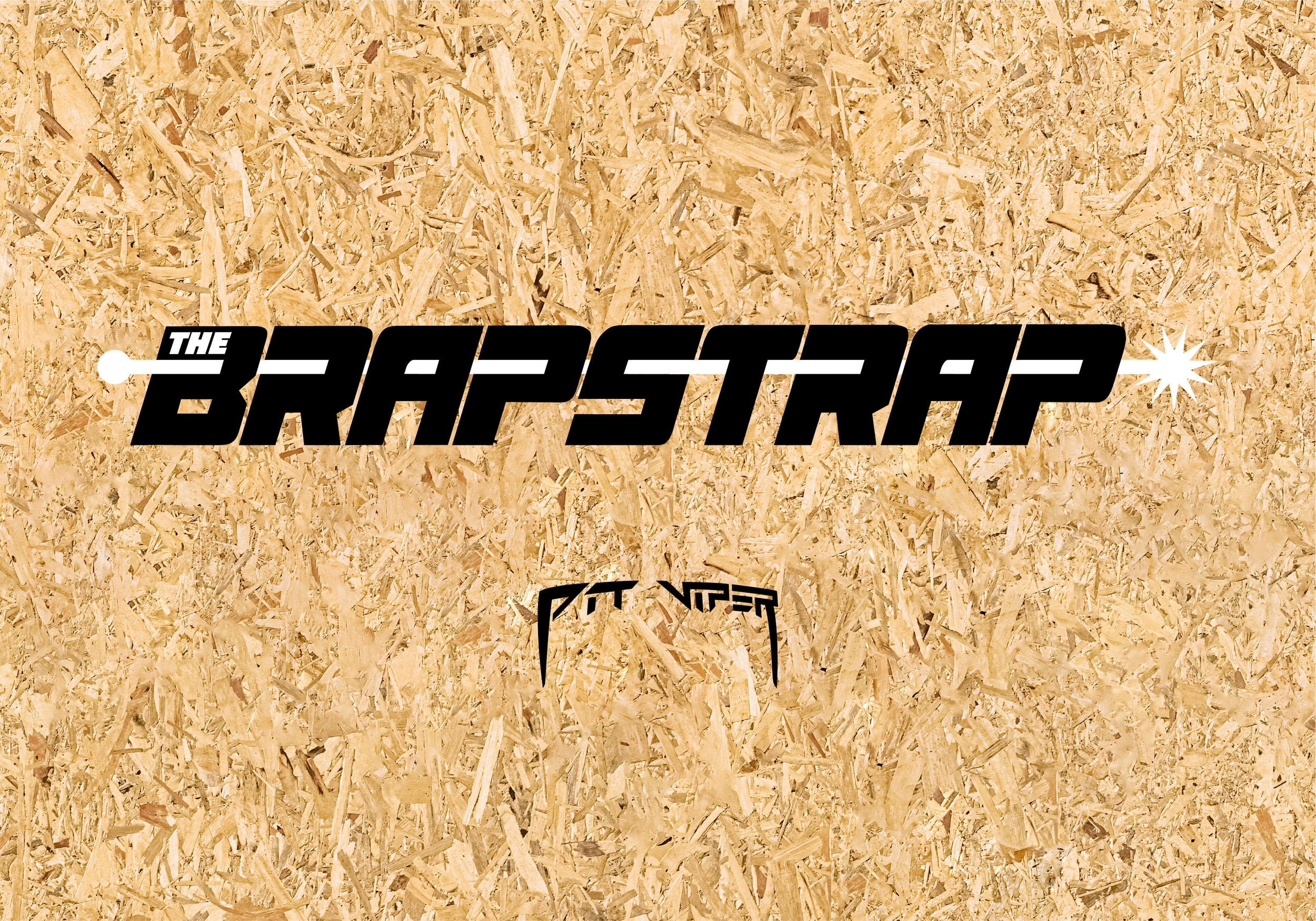
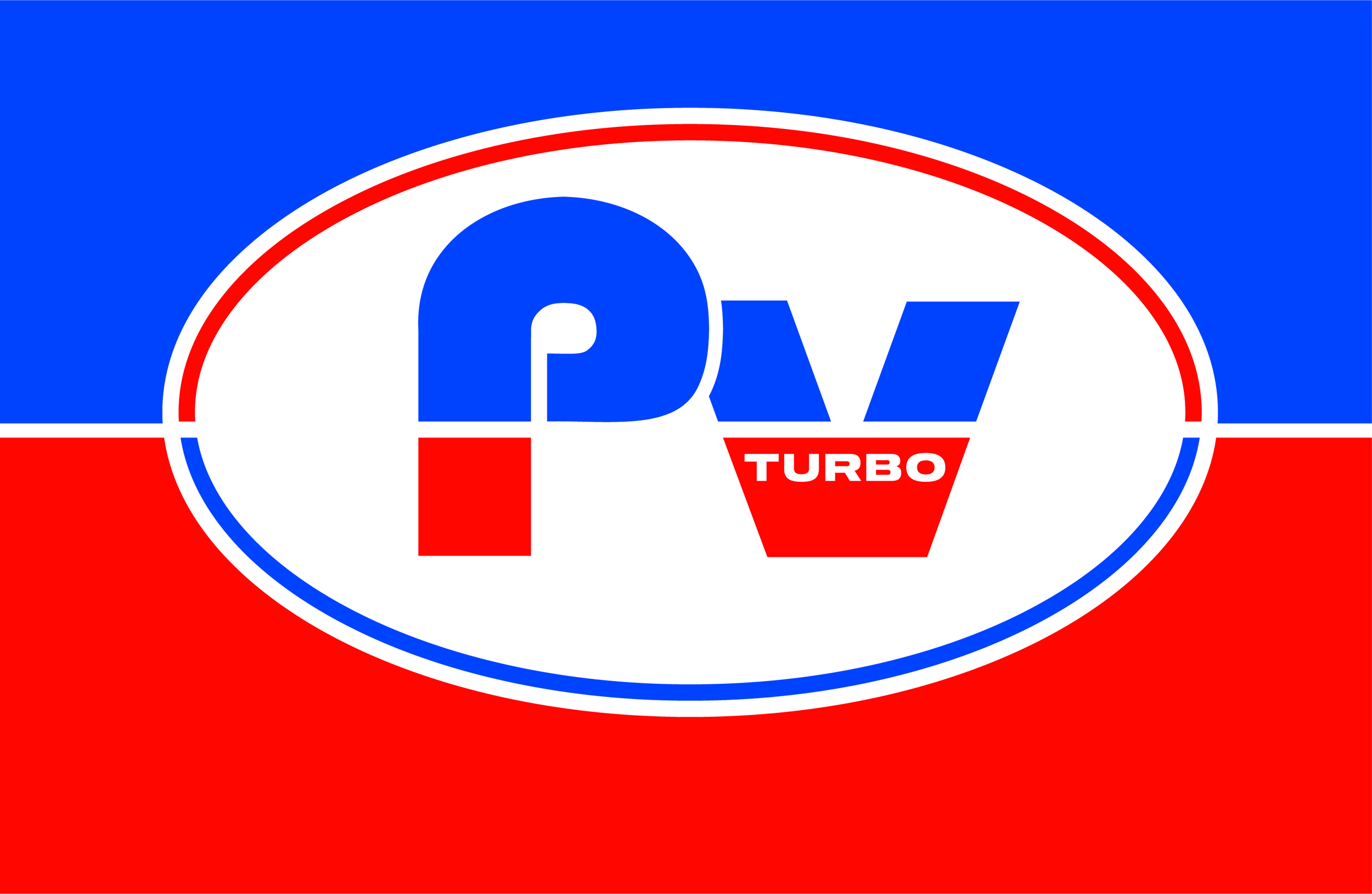
The Brapstrap logo is a modified version of the Star7 font originally created by GFRcreative. Chosen for its raceway look, the font was sheared to the right to give the feeling of speed.

Within the negative space of the letters there is a continuous line with a starburst at the end. This addition to the logo was added to represent a fuel line running through an engine leading to the spark plug, where the spark creates the combustion needed to start an engine.

Each individual goggle within this product line had very unique stand alone color palettes. To outline these specific color-ways I made the design decision to create a customizable tri-tone color palette that could be modified per goggle model.

The main pattern used for this branding is OSB particle-board plywood. When building ramps as a DIY’er, plywood is your best friend.
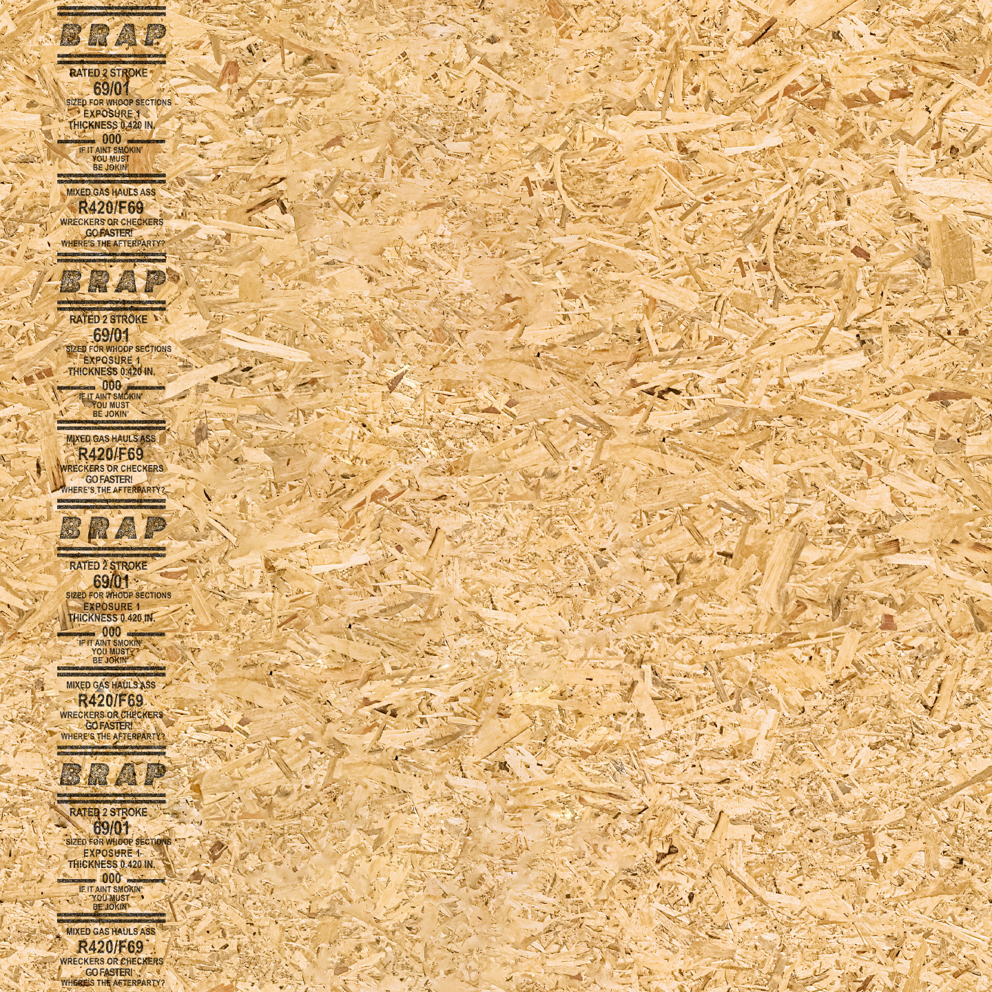


Because the packaging for this product was a large rectangle, it was designed to emulate a stack of plywood that you would see at your local hardware store.

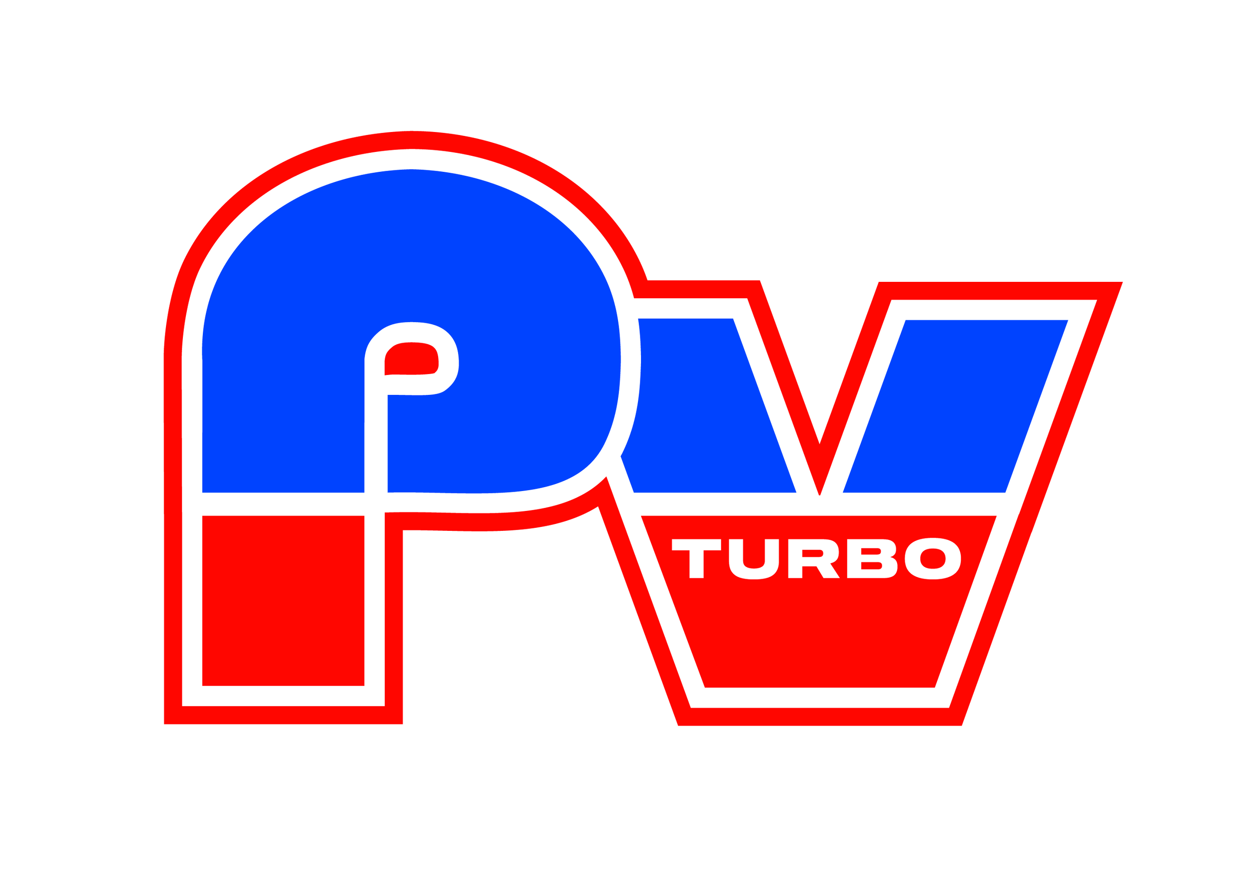
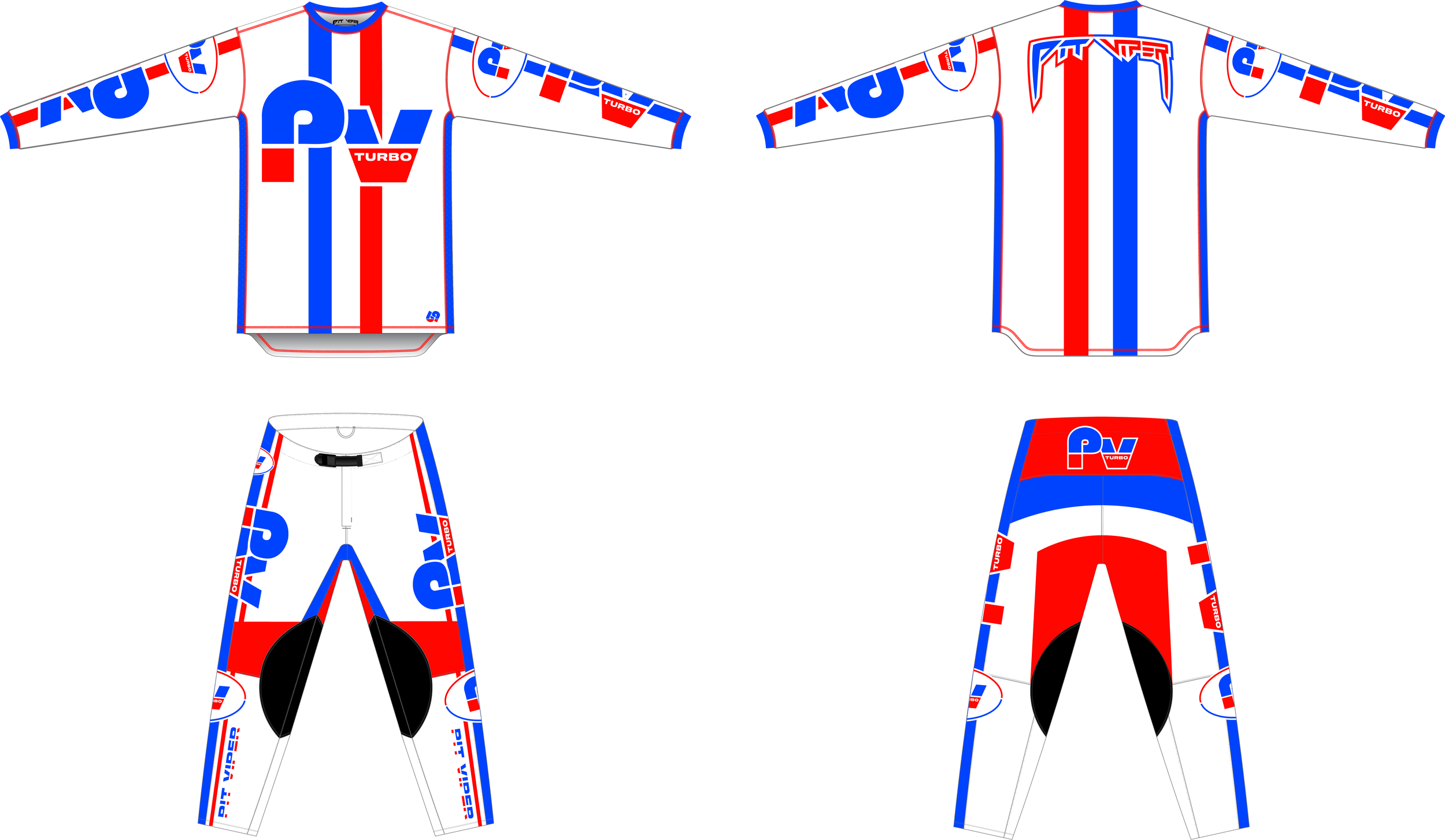
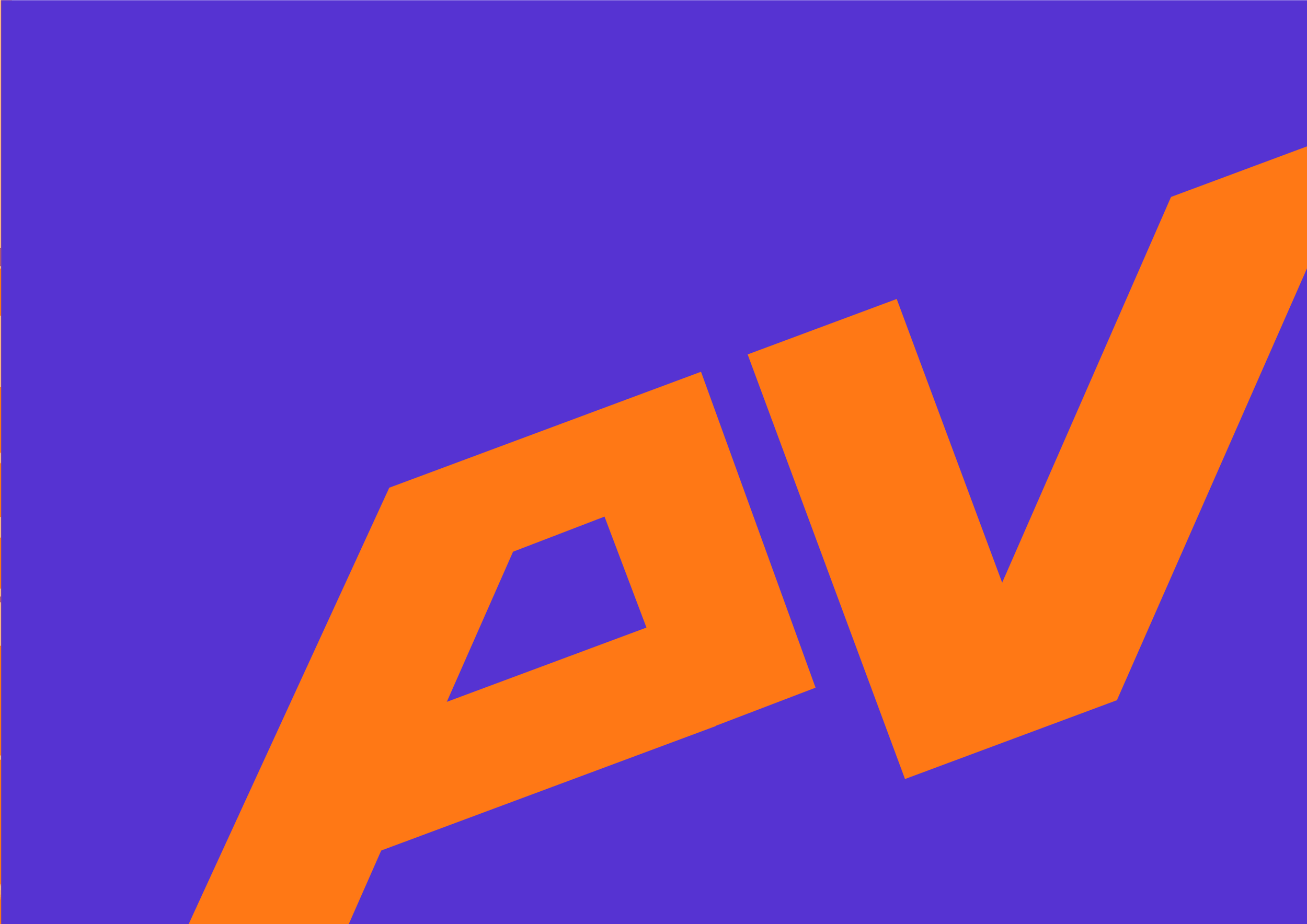
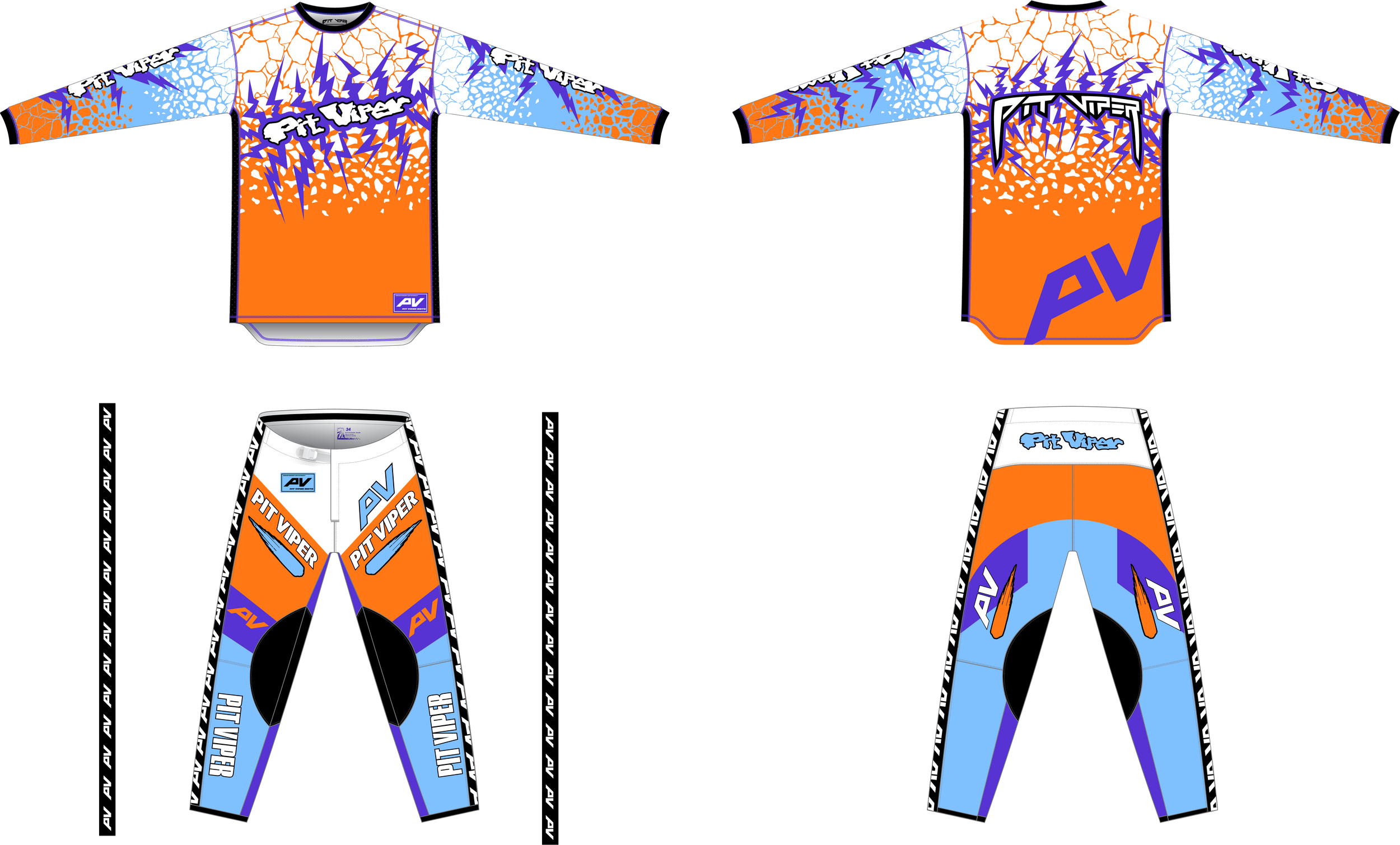
The two motocross kits in this collection were designed in correlation with The Brapstrap goggle as part of its release.